# 2. Stats preview card component

# Objetivo
- Challenge Frontend Mentor (opens new window)
- Live Demo (opens new window)
- Source Code. Github MHerdez (opens new window)
# Maquetación
# Estructura de archivos
- css/
- normalize.css
- style.css
- style.css.map
- design
- images/
- index.html
- style.scss
# Recursos adicionales
- SASS (opens new window)
- Normalize.css (opens new window)
- Universal Box Sizing (opens new window)
- Live Sass Compiler (VSC) (opens new window)
- @media (opens new window)
- @media (width:) (opens new window)
# HTML
<!DOCTYPE html>
<html lang="es">
<head>
<meta charset="UTF-8">
<meta name="viewport" content="width=device-width, initial-scale=1.0">
<!-- displays site properly based on user's device -->
<link rel="icon" type="image/png" sizes="32x32" href="./images/favicon-32x32.png">
<title>Newbie #02</title>
<link rel="stylesheet" href="./css/normalize.css">
<link rel="preconnect" href="https://fonts.googleapis.com">
<link rel="preconnect" href="https://fonts.gstatic.com" crossorigin>
<link href="https://fonts.googleapis.com/css2?family=Lexend+Deca&display=swap" rel="stylesheet">
<link href="https://fonts.googleapis.com/css2?family=Inter:wght@400;700&display=swap" rel="stylesheet">
<link rel="stylesheet" href="./css/style.css">
</head>
<body>
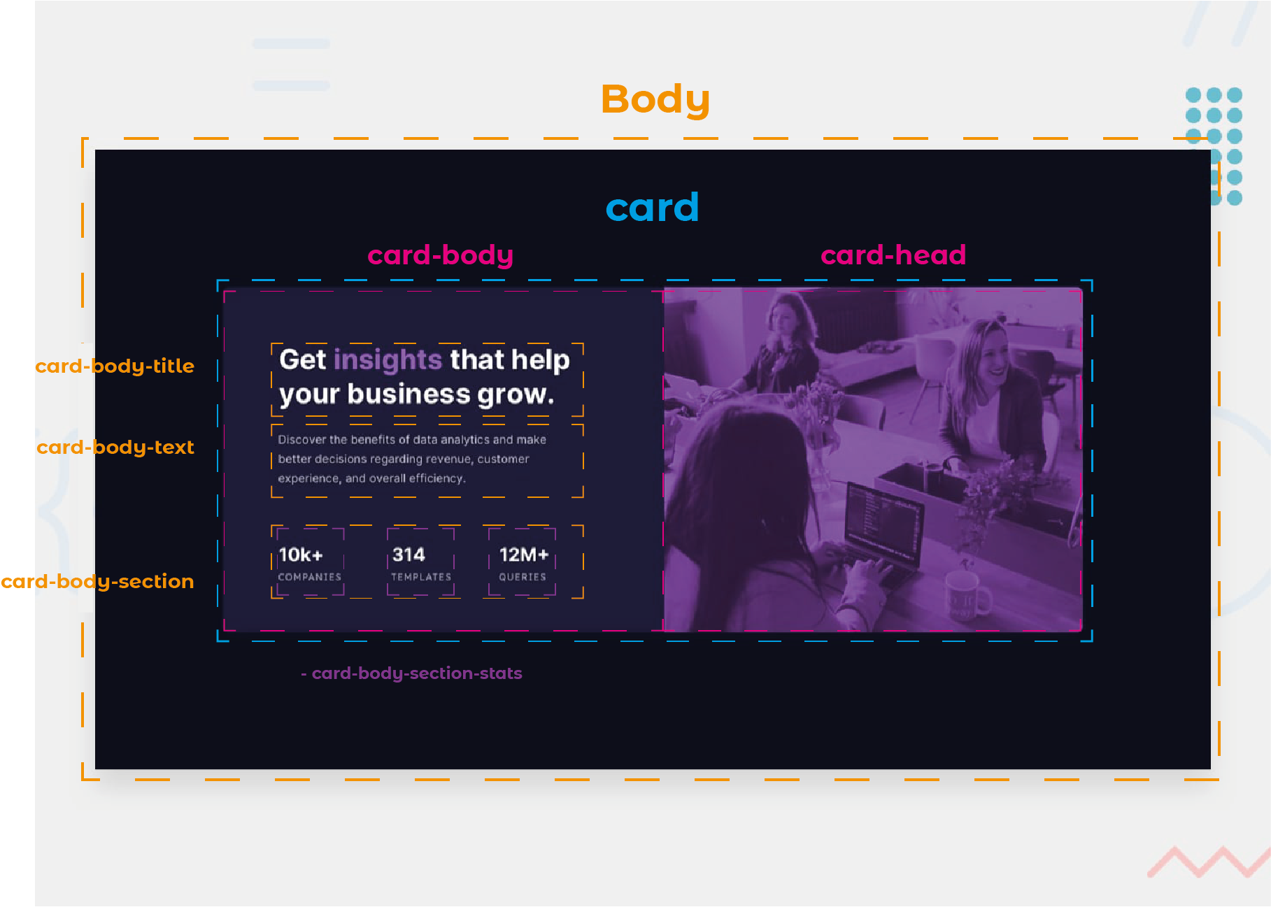
<div class="card">
<div class="card-head"></div>
<div class="card-body">
<div class="card-body-title">
Get <span>insights</span> that help your business grow.
</div>
<div class="card-body-text">
Discover the benefits of data analytics and make better decisions regarding revenue, customer
experience, and overall efficiency.
</div>
<div class="card-body-section">
<div class="card-body-section-stats">
<h3>10k+ </h3>
<p>companies</p>
</div>
<div class="card-body-section-stats">
<h3>314 </h3>
<p>templates</p>
</div>
<div class="card-body-section-stats">
<h3>12M+ </h3>
<p>queries</p>
</div>
</div>
</div>
</div>
</body>
</html>
# style.scss
# Variables
$very-dark-blue             : hsl(233, 47%, 7%);
$dark-desaturated-blue      : hsl(244, 38%, 16%);
$soft-violet-accent         : hsl(277, 64%, 61%);
$white-main                 : hsl(0, 0%, 100%);
$slightly-transparent-main  : hsla(0, 0%, 100%, 0.75);
$slightly-transparent-stats : hsla(0, 0%, 100%, 0.6);
# Configuración global CSS
html, body {
  box-sizing: border-box;
  background: $very-dark-blue;
  height: 100vh;
}
*, *:before, *:after {
  box-sizing: inherit;
}
# body
body {
  display: flex;
  justify-content: center;
  align-items: center;
  color: $white-main;
  font-size: 15px;
  font-family: 'Lexend Deca', sans-serif;
  font-family: 'Inter', sans-serif;
}
# Card
Configuración del componente
# .card
.card {
  display: flex;
  flex-direction: row-reverse;
  background: $dark-desaturated-blue;
  width: 100%;
  max-width: 1062px;
  border-radius: 8px;
  overflow: hidden;
}
# Card Head
Configuración de la primera sección de la Card (derecha)
# .card-head
.card {
  display: flex;
  flex-direction: row-reverse;
  background: $dark-desaturated-blue;
  width: 100%;
  max-width: 1062px;
  border-radius: 8px;
  overflow: hidden;

  &-head {
    flex-basis: 50%;
    background-image: url(../images/image-header-mobile.jpg);
    background-repeat: no-repeat;
    background-color: hsla(277, 70%, 45%, .7);
    background-blend-mode: soft-light;
    background-size: cover;
    min-height: 426px;
  }
}
# Card Body
Configuración de la segunda sección general de la Card (izquierda) y sus subsecciones (title, text y section)
# .card-body
&-body {
   flex-basis: 50%;
   padding: 4.4rem;
}
# - Title
# .card-body-title
&-title {
   font-size: 2.1rem;
   font-weight: 700;
   line-height: 2.5rem;
   letter-spacing: 1px;
   margin-bottom: 1.6rem;

   span {
      color: $soft-violet-accent;
   }
}
# - Text
# .card-body-text
&-text {
   font-size: 0.85rem;
   font-kerning: normal;
   line-height: 1.5rem;
   padding-right: 3rem;
   color: $slightly-transparent-stats;
   margin-bottom: 4.5rem;
}
# - Section
# .card-body-section
&-section {
   display: flex;
   justify-content: space-between;
   padding-right: 3rem;

   &-stats {
      h3 {
         margin: 0px 0px 7px 0px;
         font-size: 1.5rem;
         font-weight: 700;
      }
      p {
         margin: 0px;
         color: $slightly-transparent-stats;
         text-transform: uppercase;
         font-size: .8rem;
         font-family: 'Lexend Deca', sans-serif;
         letter-spacing: 1px;
      }
   }
}
# Diseño responsivo (2da. parte del desafío)

# @media()
@media (max-width: 768px)  {
  body {
    padding: 2rem;
  }
  .card {
    flex-direction: column;
    text-align: center;

    &-body {
      &-text {
        font-size: 1.2rem;
        font-kerning: normal;
        line-height: 2rem;
      }

      &-section {
        flex-direction: column;

        &-stats {
          margin-bottom: 2.2rem;
        }
      }

    }

  }
}